
There is an ongoing debate in the design world about Flat UI (User Interface) Design Vs Skeuomorphism (realism). In this article, I compare the characteristics between the two design techniques.
For those of you who do not know what Skeuomorphism is about, it is a design technique when a designer designs an art work and try to mimic the exact characteristics of the design material in reality. In other words, such design or composition might have shadow, texture, gradient etc
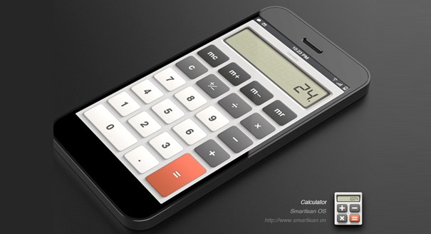
Examples of Skeuomorphism UI Design

Flat means level or solid while UI means user interface. Flat UI Design employ the use of solid colours. Example is, if the designer wants to depict a calculator, he flattens the bulkiness or mass of the material and just use solid colours devoid of gradient, shadows, texture etc.
Apple computers with their early OS X versions meant glass everywhere used the Skeumorphism technique. Now with the latest version of iOS 8 employs Flat UI Design. Microsoft’s Windows 8 also introduced Flat UI in their Metro UI design.
Design in Flat UI looks clean and simple. Simplicity is synonymous to Flat UI. Skeumorphism on the other hand might look complex but detail oriented.
Examples of Flat UI Design

